


Is a team specializing in the planning and operations of bicycle-related transit goals. Clients range from companies wanting to install racks for their employees, to cities that want to offer secure parking for it’s non-car commuters, and everyone in-between. Their goal is to make it easy and secure for people wanting to use their bikes as a means of transportation to do so.
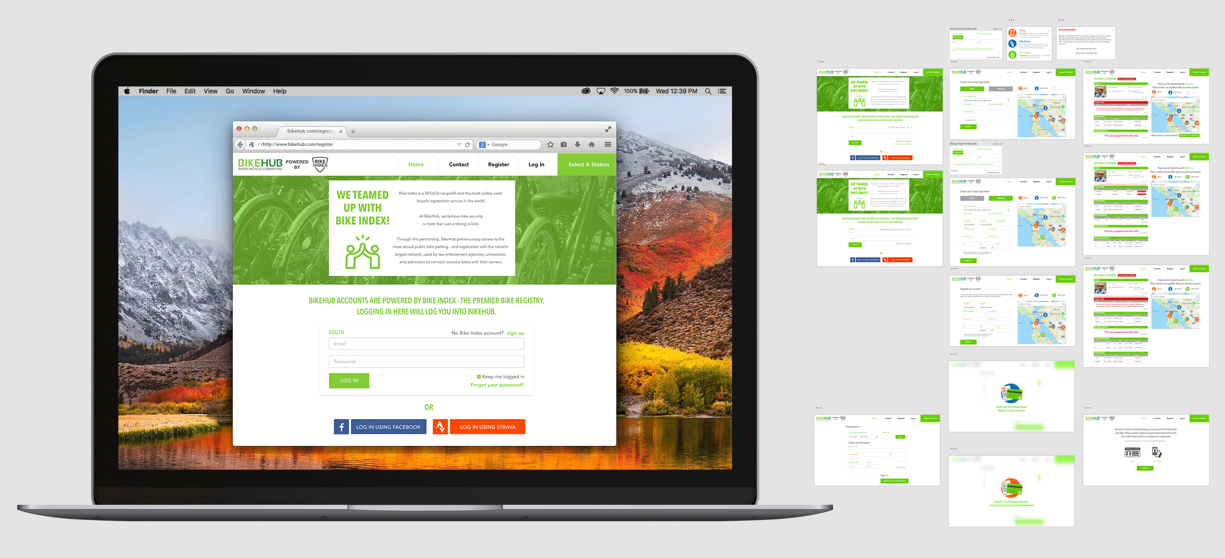
BikeHub’s needs varied greatly and I helped tackle numerous projects while working with them. Larger projects included adding pages and functionality to their site to integrate Bike Index, a registration resource combating bike theft, into their user database and sign up process. (above)
Other projects included flyers and one pagers for community outreach, and operational designs like employee IDs and way-finding or informational signage. (Below)
Because BikeHub is a service for individuals in the public space I helped design visuals for many environmental spaces. Each hub location is unique in scale and area. Site-specific graphics are kept clean and minimal so that they don’t compete with way-finding signs, which I also created for use across all hubs
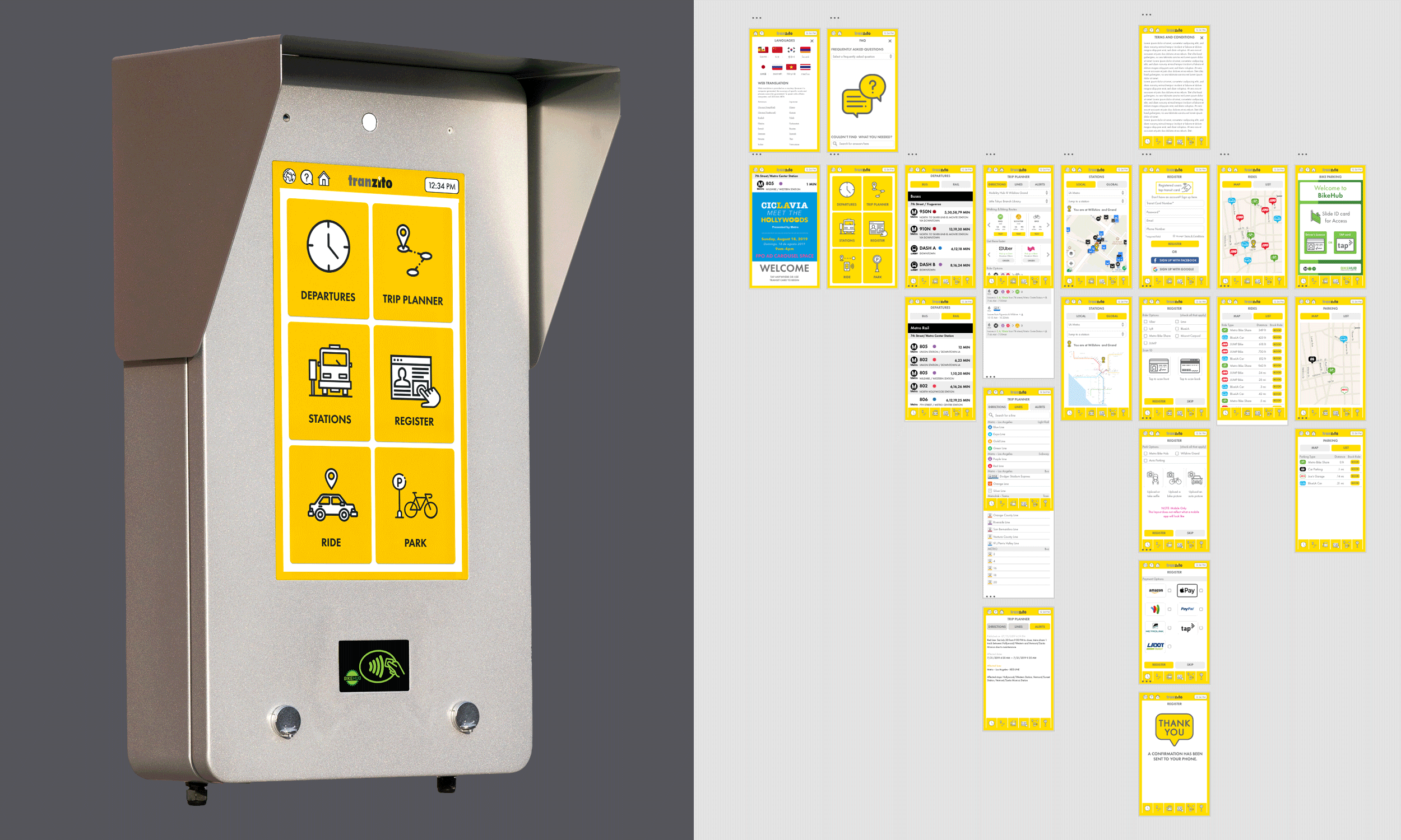
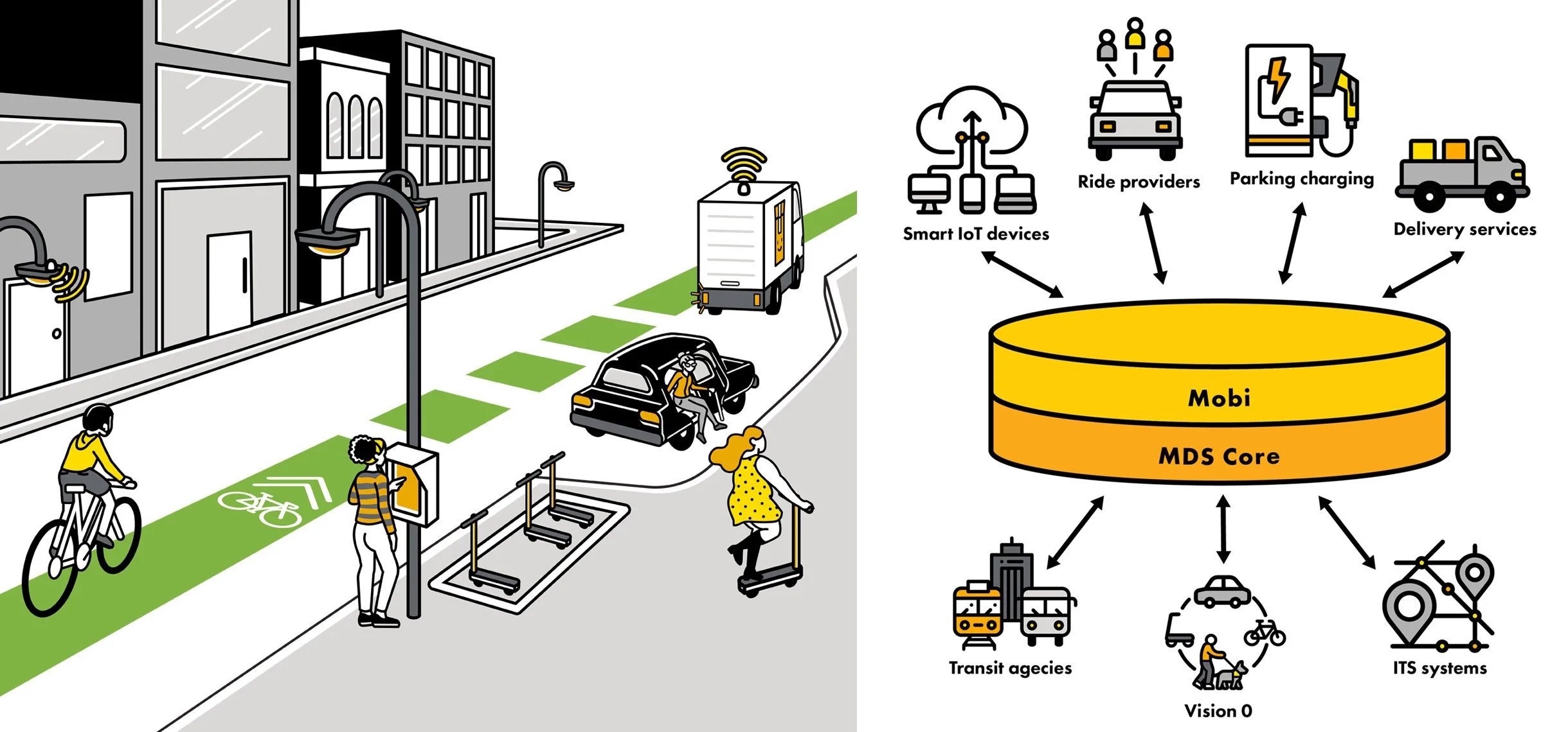
BikeHub also had a sister company during my time there which ended up becoming the parent company Tranzito. I helped with the initial branding while they were in the funding phase and actively pitching for RFPs. The work that ended up sticking, however, was the UI of a physical kiosk for public transportation users in the Los Angeles metropolitan area to engage with multimodal transportation without needing a cell phone. An example would be hailing a ride share without downloading an app, and paying with a metro card.
Because I was the only designer working on that project at the time I was able to create all of the iconography and illustration work for their UI and pitches which was a fun bonus.